vAuto empowers fleet vehicles with Ai-capabilities. The goal of this project was to design and develop a website that showcases the client's family of products targeting both technical and non-technical business clients for the company. The website should reflect the company branding, be visually appealing, and deliver complex information in the easiest way possible.
UI Design | Webflow development | Design direction
Traffic monitoring systems
8 weeks
Project scope
The website had to speak to technical experts without overwhelming non-technical visitors with technical details so the website needed to be practical, informative yet creative and eye-catching.
My role
✅ Transform UX wireframes into Figma UI design
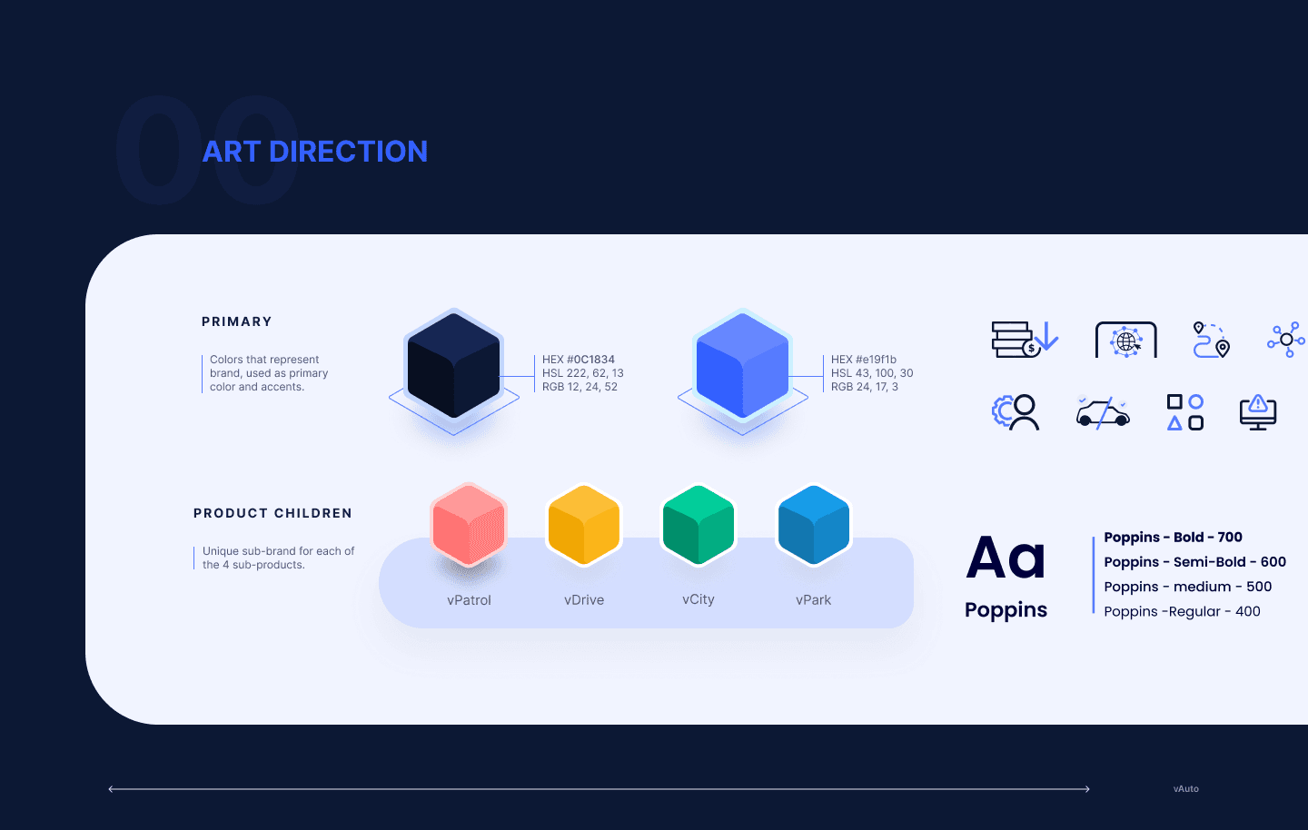
✅ Define clear art direction for visual assets (icons, Illustrations, animations, ...)
✅ Implementing the design responsively on webflow, adding animations and micro-interactions
Design process
Having the basics in place, I went through couple of Figma iterations with the UX designer before we finally agreed on the UI. Meanwhile, I had already briefed the animator to prepare videos needed for the website.
Based on the Figma design, I started implementing the layout on Webflow. building a fully responsive website that employs animations & micro-interactions to enhance both the website aesthetics and information-delivery.
Impact
Stakeholders feedback:
The final product aligned perfectly with stakeholder expectations, delivering an intuitive experience that exceeded initial requirements. Through collaborative iterations and data-driven decisions, the final design achieved unanimous approval record-breaking time.User testing:
Strategic use of visual hierarchy, consistent navigation patterns, and contextual information presentation allowed visitors to grasp product functionality more efficiently, resulting in more clarity in product understanding and reduction in learning curve.


Takeaways
Mobile -can be- first
Instead of doing mobile first, I try to study the mental models of the users and optimize the design accordingly. Mobile is not always the popular viewing deivce specially for B2B serivce mainly checked by governments and big institutions.Adaptively responsive
Although breakpoints often imply different device (tablet, mobile,...) it's good to keep in mind that this not always the case. For example: a tablet resolution could be just a desktop device that has a split screen view, specially for business users who compare different products. So I was careful not to drastically change the experience across neighbouring breakpoints.